Unbroken
A platform dedicated to uplifting federal workers who have been or are at risk of layoffs.
Role
- UX Designer
- UI Designer
- Product Manager
Time
- June 2025 - August 2025
( 3 Months )
Team
- 1 Project Lead
- 1 Engineer

Unbroken
A platform dedicated to uplifting federal workers who have been or are at risk of layoffs.
Role
Time
Team
UNDERSTANDING THE PROBLEM
Federal workers, once viewed as holding some of the most stable and long-term positions in the U.S. workforce, are now facing mass layoffs across multiple agencies. This sudden shift has left many employees experiencing uncertainty, grief, and distress as they navigate forced displacement.
Places To Thrive
is a nonprofit dedicated to creating spaces and tools that support communities experiencing displacement. During my internship with the organization, I was entrusted
to lead the design of the Unbroken App, a digital resource aimed at supporting laid-off and at-risk federal workers.
With no direct design guidance available, I stepped into a dual role as both Product Designer and Product Manager, balancing creative design with project leadership
and ensuring that the product was both empathetic and strategically grounded.
PROJECT CONSTRAINTS AND CLIENT REQUIREMENTS
Before beginning the design process, it was important to acknowledge several key constraints set by the project team.
Resource Constraints
Platform Constraint
Brand Consistency
Because Places To Thrive is a nonprofit, this project faced a deadline to be elligible for grants. I needed to adhere diligently to my own project roadmap in order to have a succesfful deliverable.
The client specifically requested the development of a mobile app in order to consolidate all resources available.
While the client had an existing website and brand assets, there was no app-specific style guide. I needed to create a design system to extend the organization's visual identity across this new platform.
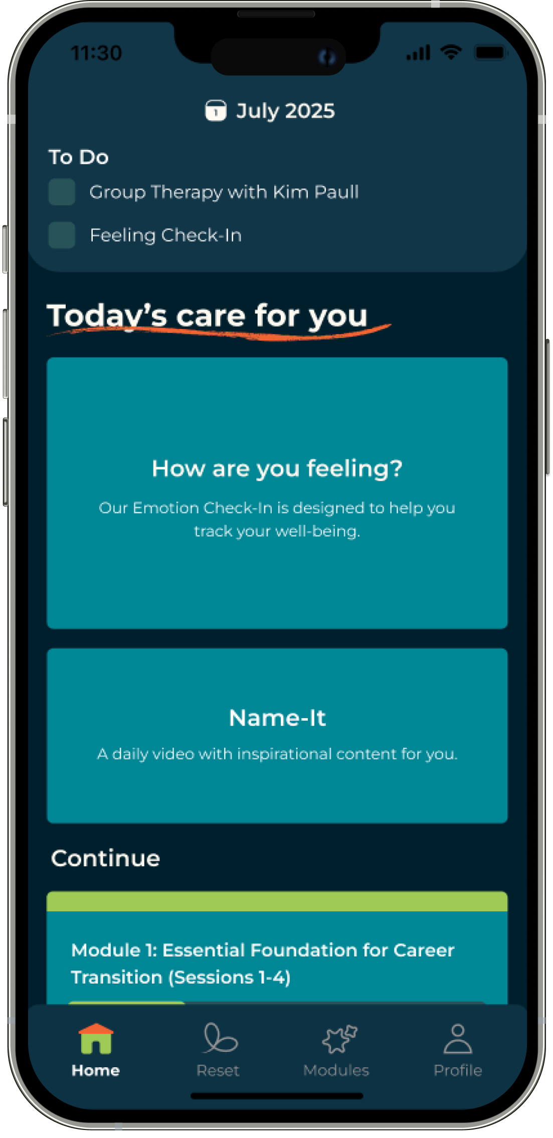
THE SOLUTION
The Unbroken App
The Unbroken App was designed to meet users where they are, recognizing that everyone moves through displacement and career transitions at a different pace. The app provides flexible support tailored to the user's stage:
WHAT I DID:
KEY FEATURES
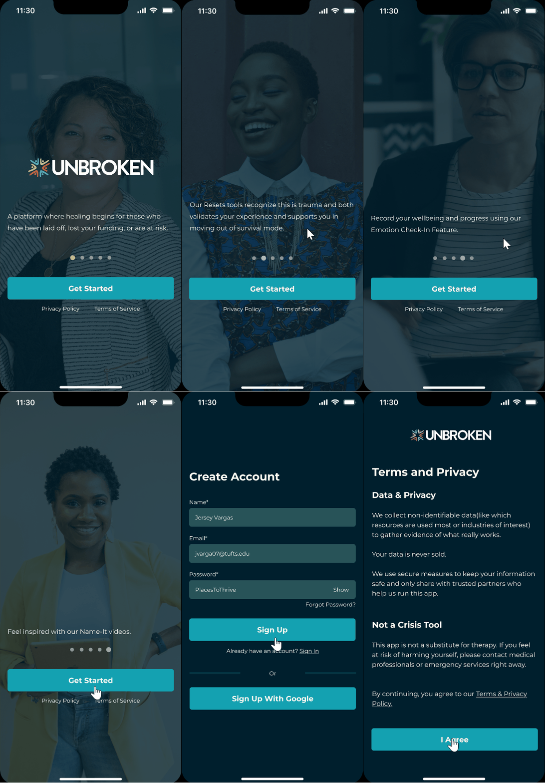
Personalize your support by taking our onboarding quiz.
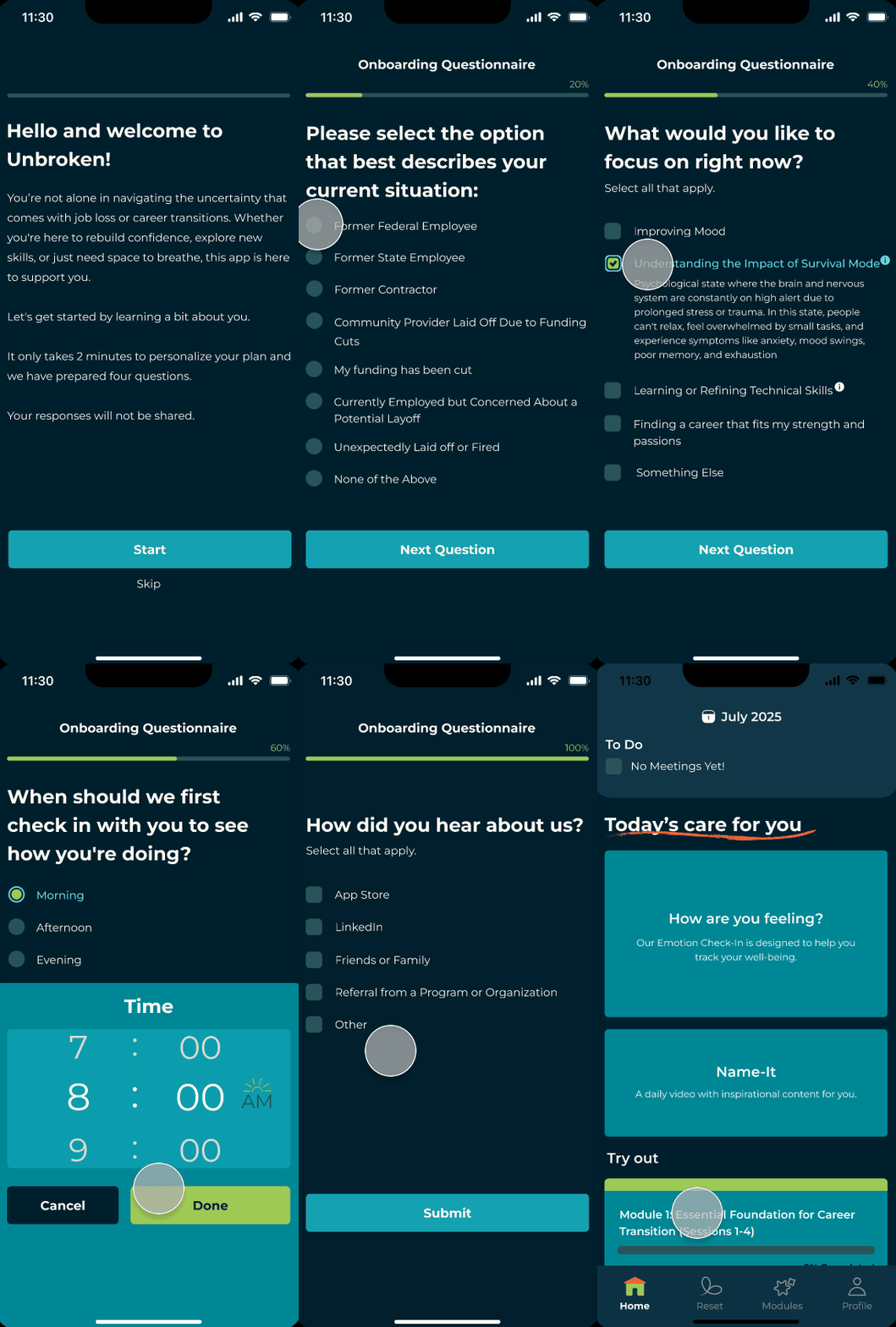

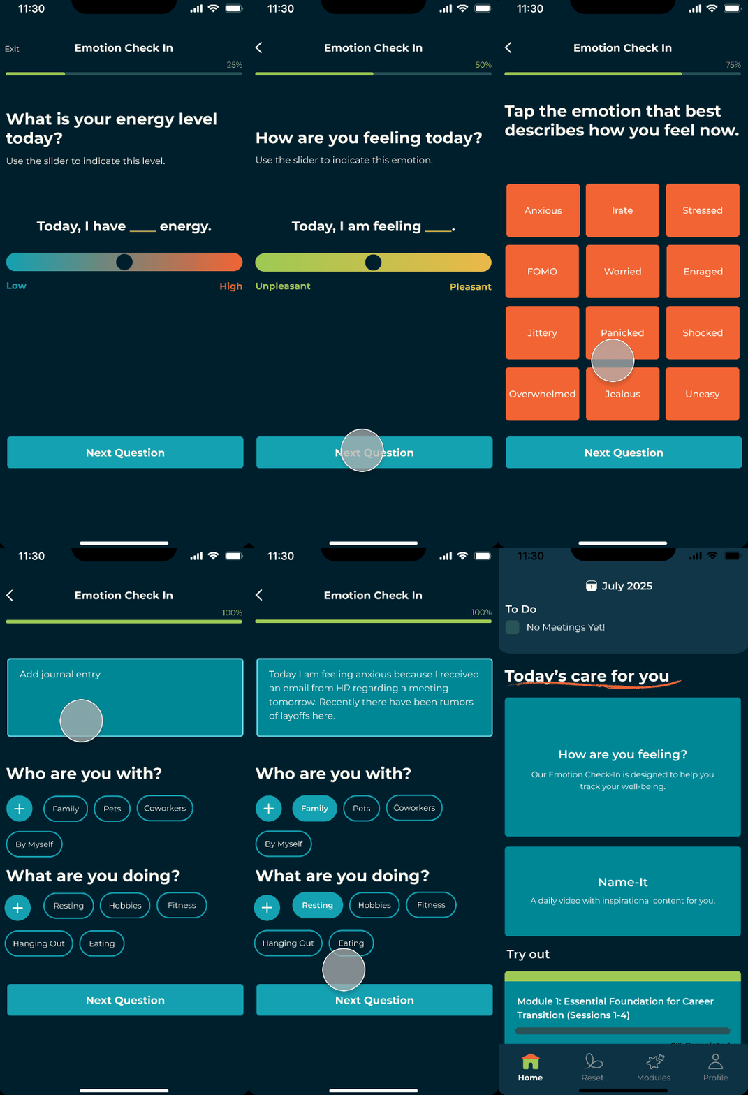
Reflect on your journey by using our Emotion Check In
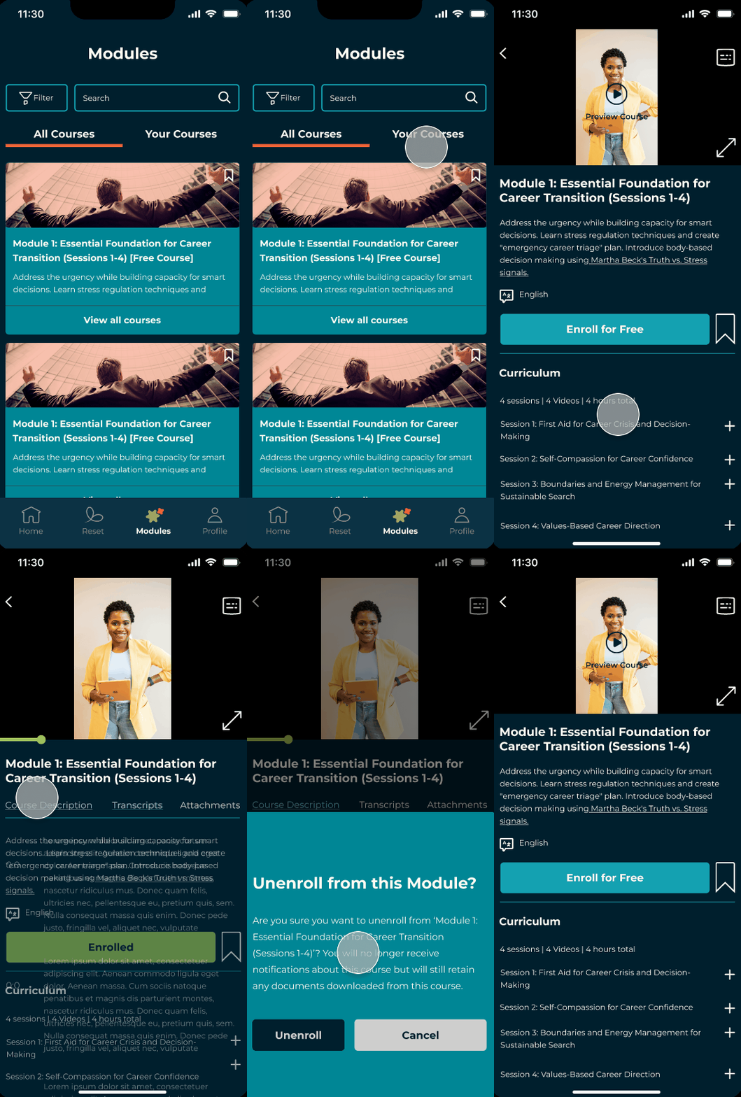
Pick up new skills or learn how to cope with feelings of dread by participating in a module.
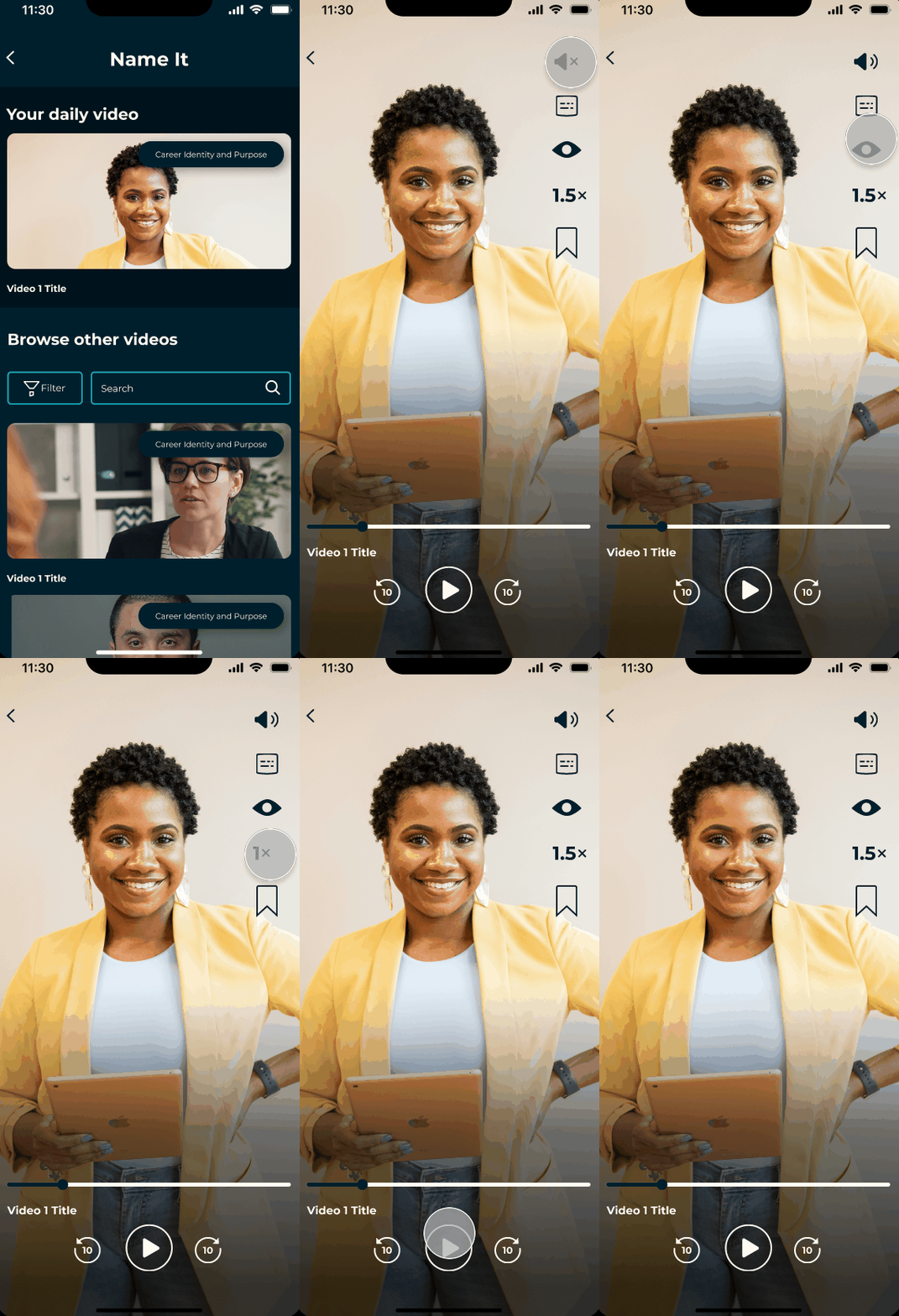
Feel encouraged and gain inspiration with your daily recommended NameIt video, or browse the rest of our collection.
How did we arrive at this solution?
Through lots of discussion and consideration of resource constraints!
RESEARCH + CHALLENGES
At the start of the project, I noticed a disconnect: the client had already developed a solution but had not conducted structured user interviews to validate it.
Recognizing the need for user insights, I advocated for formal user interviews and proposed that these sessions be recorded and documented to ensure that design decisions could be grounded in real user experiences. I worked with the Product Lead to develop user interview questions that would identify pain points of users.
Recruiting participants, however, was challenging. Many community members were still grieving and not ready to engage, which led to two weeks with minimal interview sign ups.
"Mostly it's overwhelming shame, mixed with bitterness about the relationships you've built with people. Relationships are what make up career satisfaction. When you've had each other's backs, suddenly realizing you're dispensable cuts even deeper." - Interview Participant
We supplemented our findings with a competitor analysis to understand how other apps navigated mental health and coaching resources. Because our problem space was nuanced, we even looked at social media apps.
These findings allowed us to create user personas to help narrow down the features we could implement.
Our team was running on a deadline to be elligible for grants, so we created a MVP (minimum viable product).
IMPLEMENTATION
We developed a user flow chart and conducted a competitor analysis as we prepared for wireframing and branding.
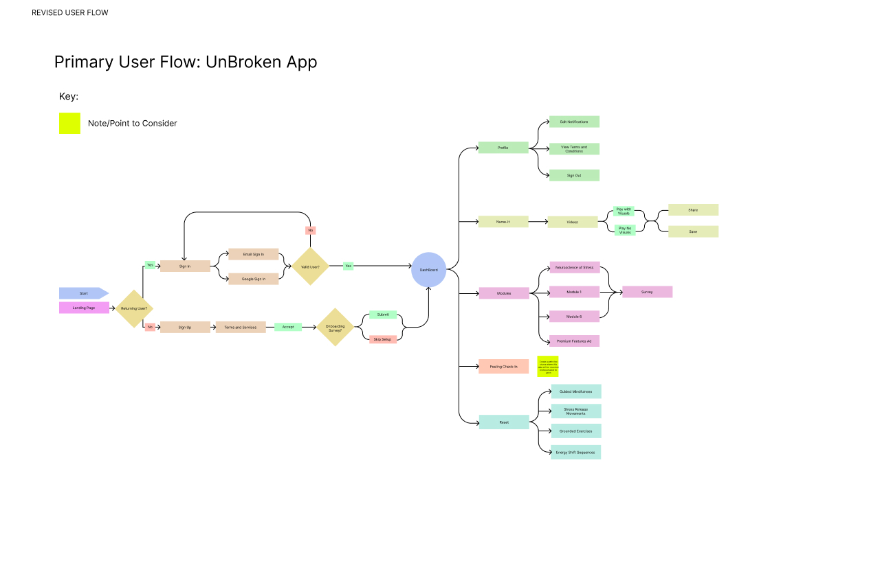
User Flow
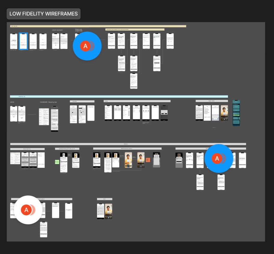
Wireframes
BRANDING + UI DESIGN
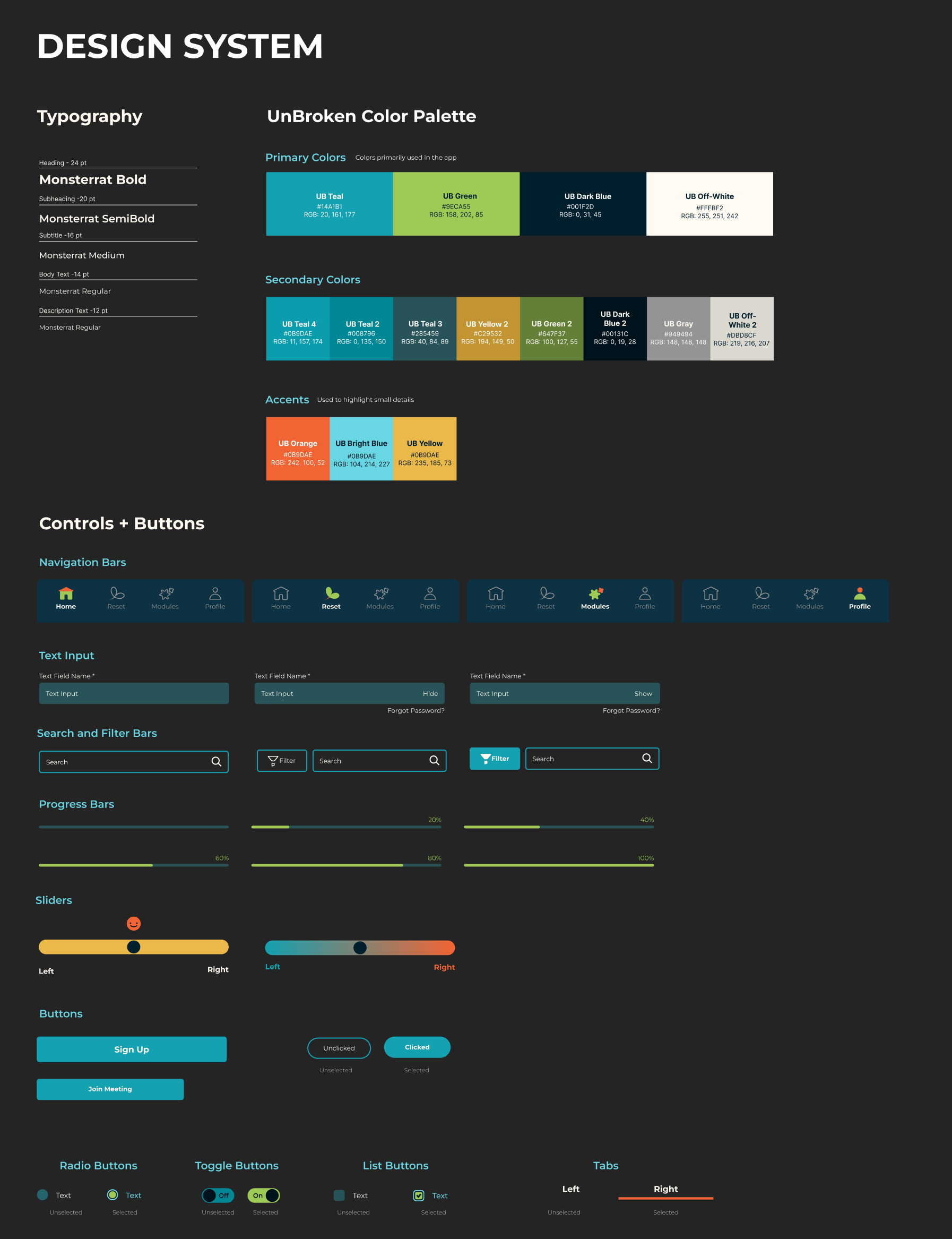
I created brand guidelines and a design system for Unbroken. I began by researching the Places to Thrive website and logo, and I drew colors from that palette. Since the client didn't have direct color codes or typeface names to provide, I selected typefaces that were very similar to those used on their website and presented a curated set of fonts to choose from.
In total, I created over 40 components.
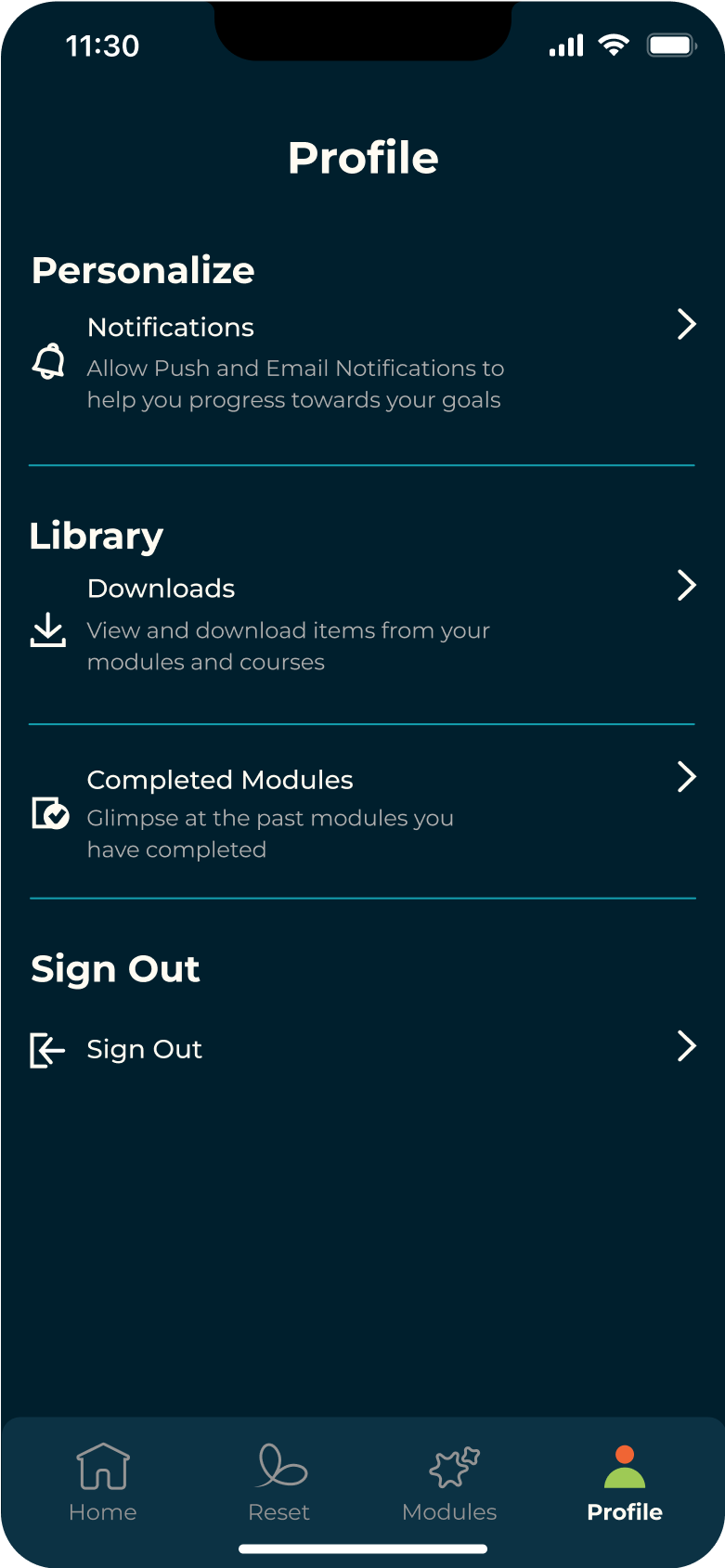
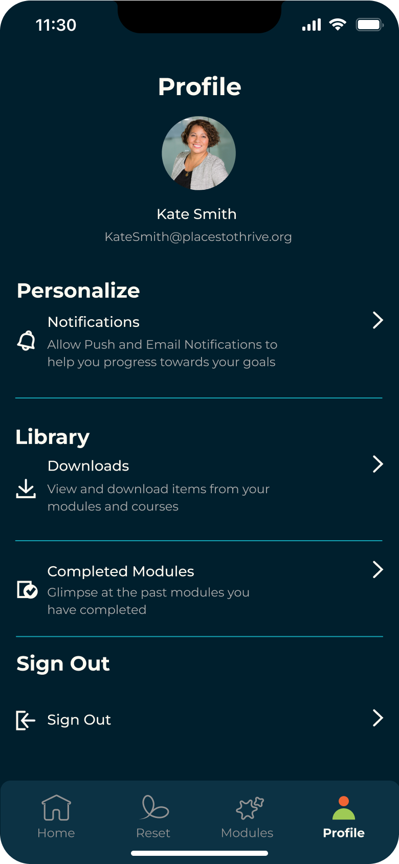
USER TESTING IMPROVEMENTS
After developing our MVP, we were ready to conduct user testing.
The following are improvements made to the interface of the app after user tests.
First Iteration
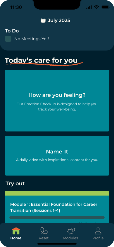
Second Iteration

First Iteration
Second Iteration
FINAL SCREENS
App Feature Preview + Terms and Conditions

Reflect on your journey by using our Emotion Check In
Pick up new skills or learn how to cope with feelings of dread by participating in a module.


Feel encouraged and gain inspiration with your daily recommended NameIt video, or browse the rest of our collection.
Customize your profile + adjust settings

Track and record your meetings and journal entries with our Calendar
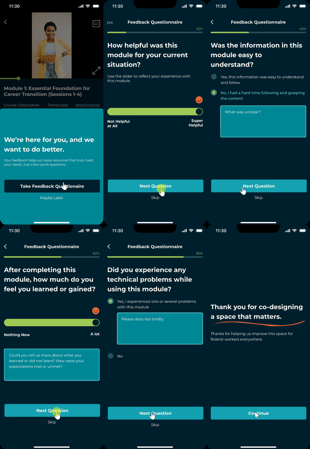
Feedback questionaire

WHAT I LEARNT
Balancing Design + Management
This experience taught me how to operate independently, make decisions with imperfect information, and lead a project from both the design and management side. I left with stronger skills in not just UX/UI design, but also in product leadership and stakeholder management.