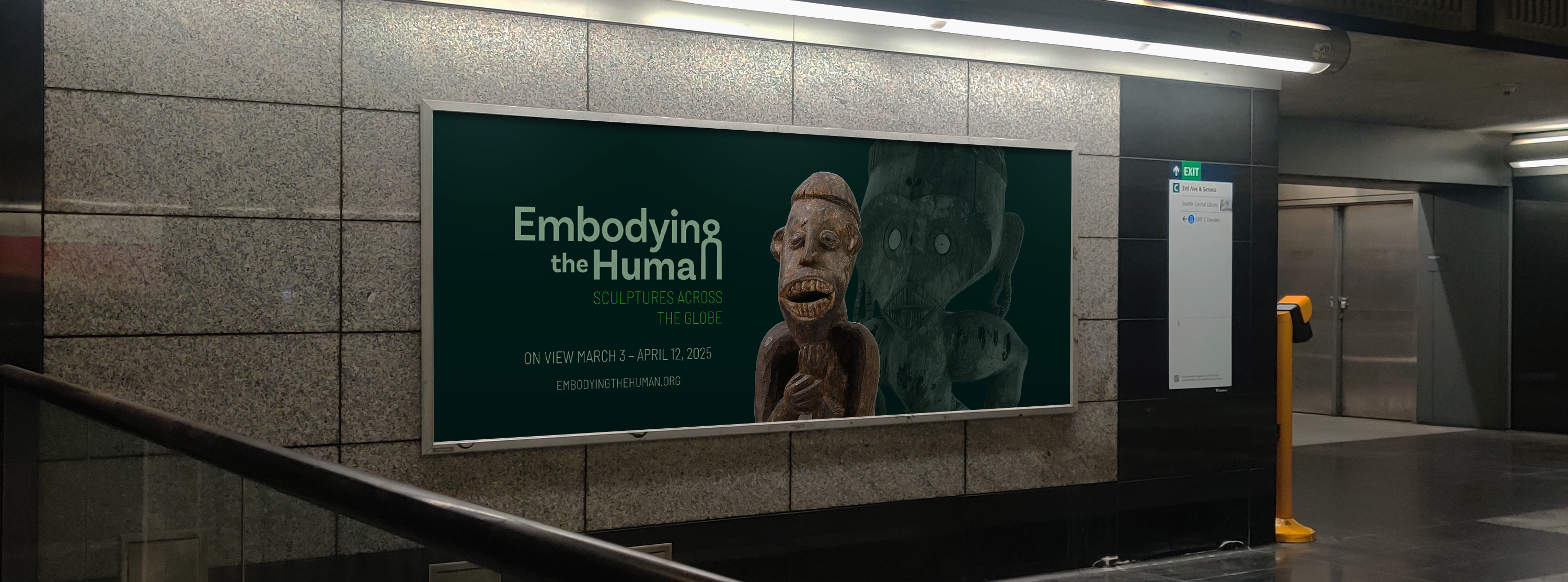
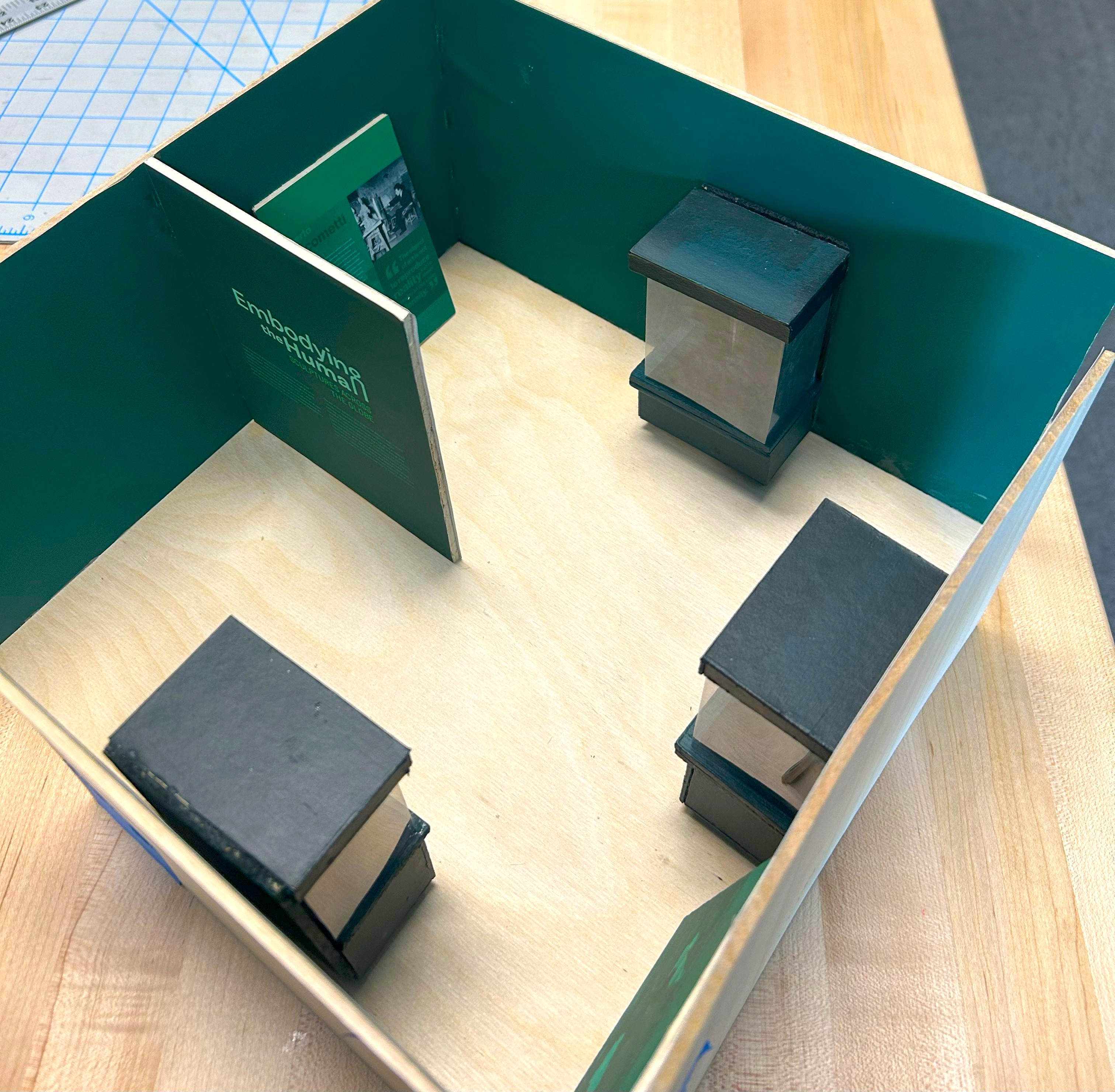
Embodying the Human: Sculptures Across the Globe
Category: Exhibition Design, Brand Strategy, Brand Identity, Collateral Design
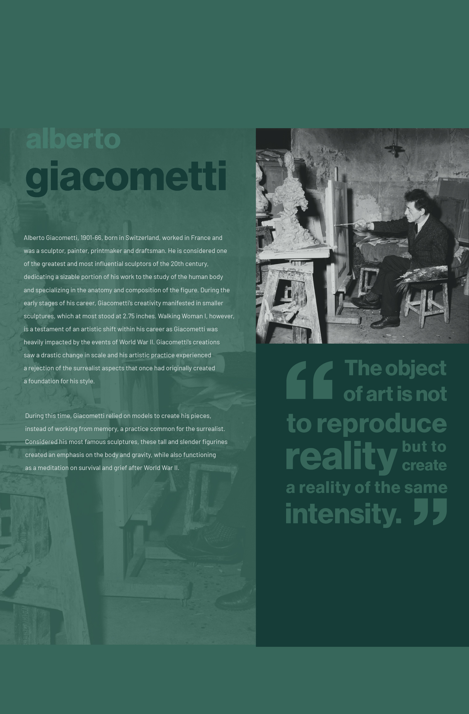
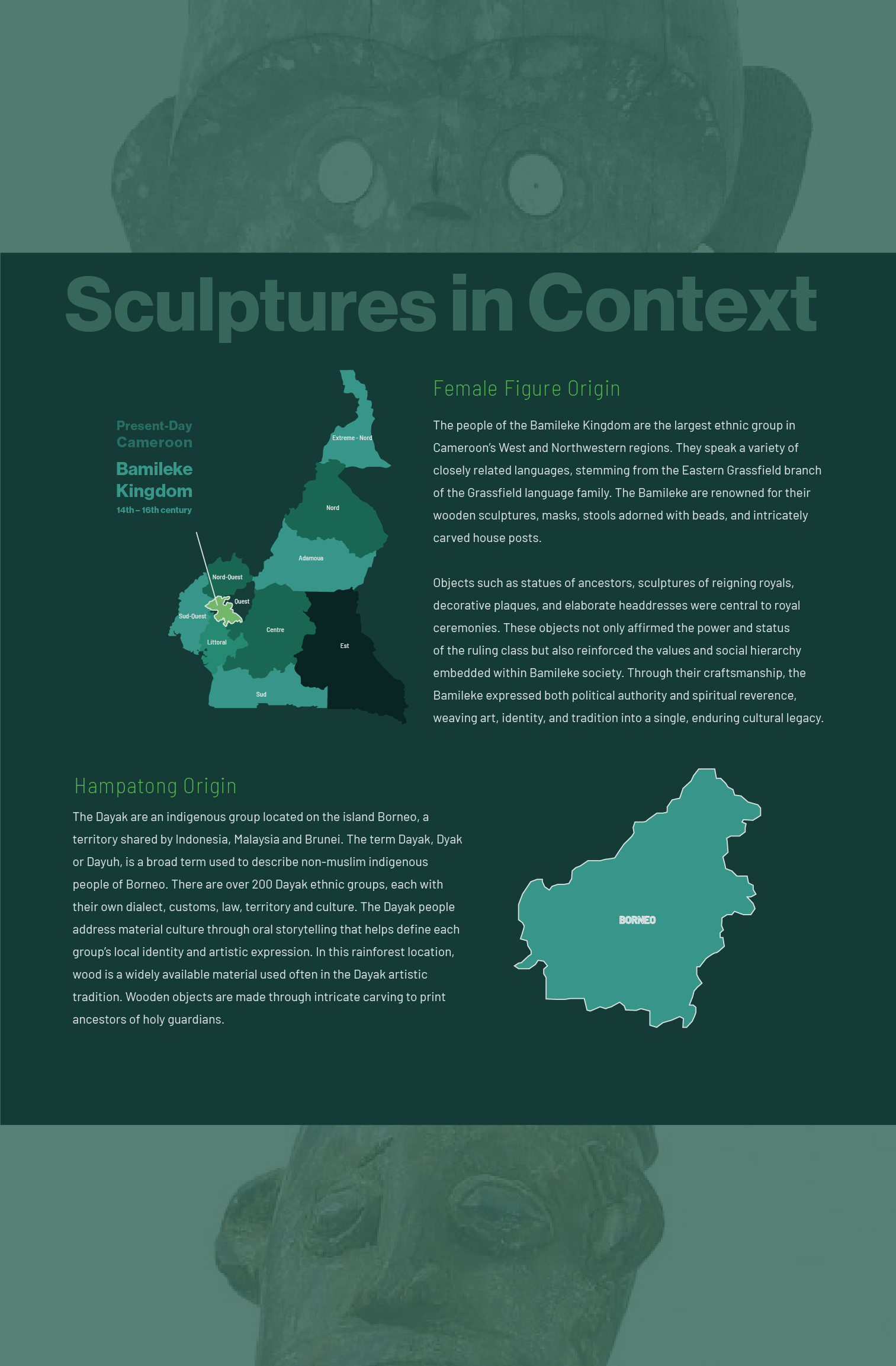
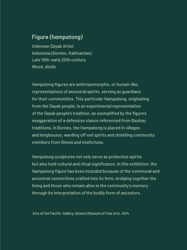
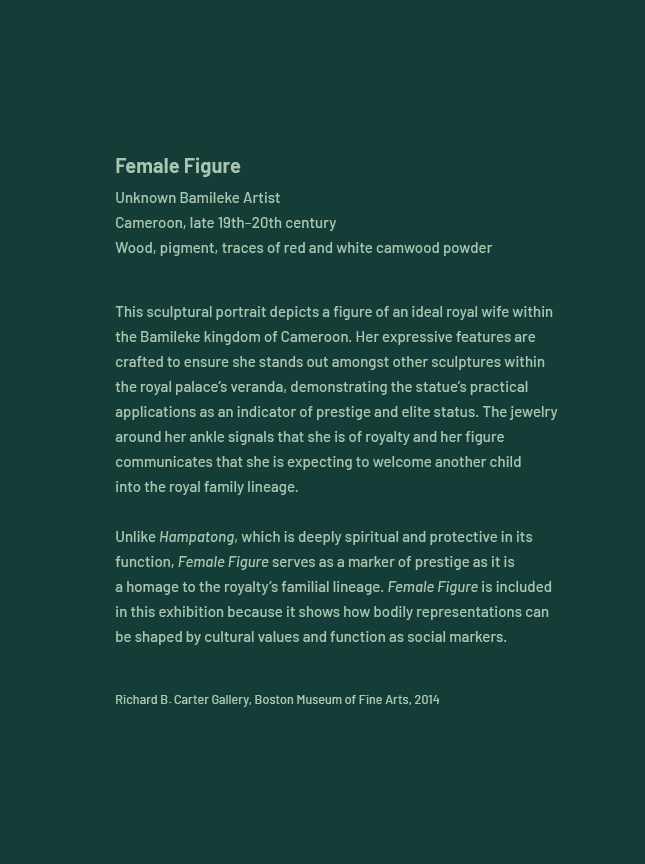
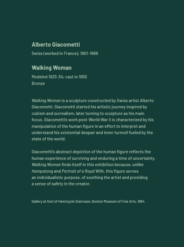
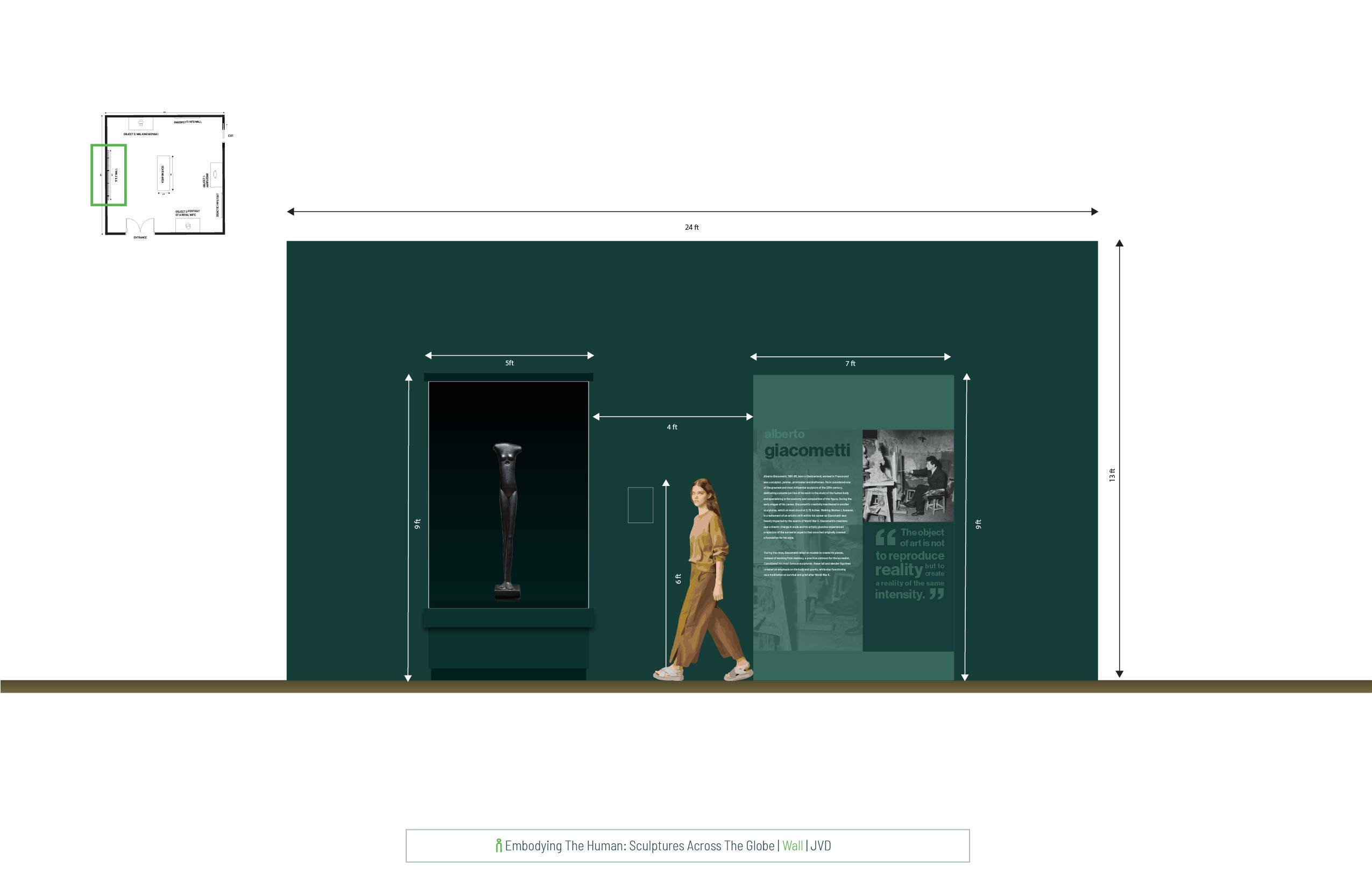
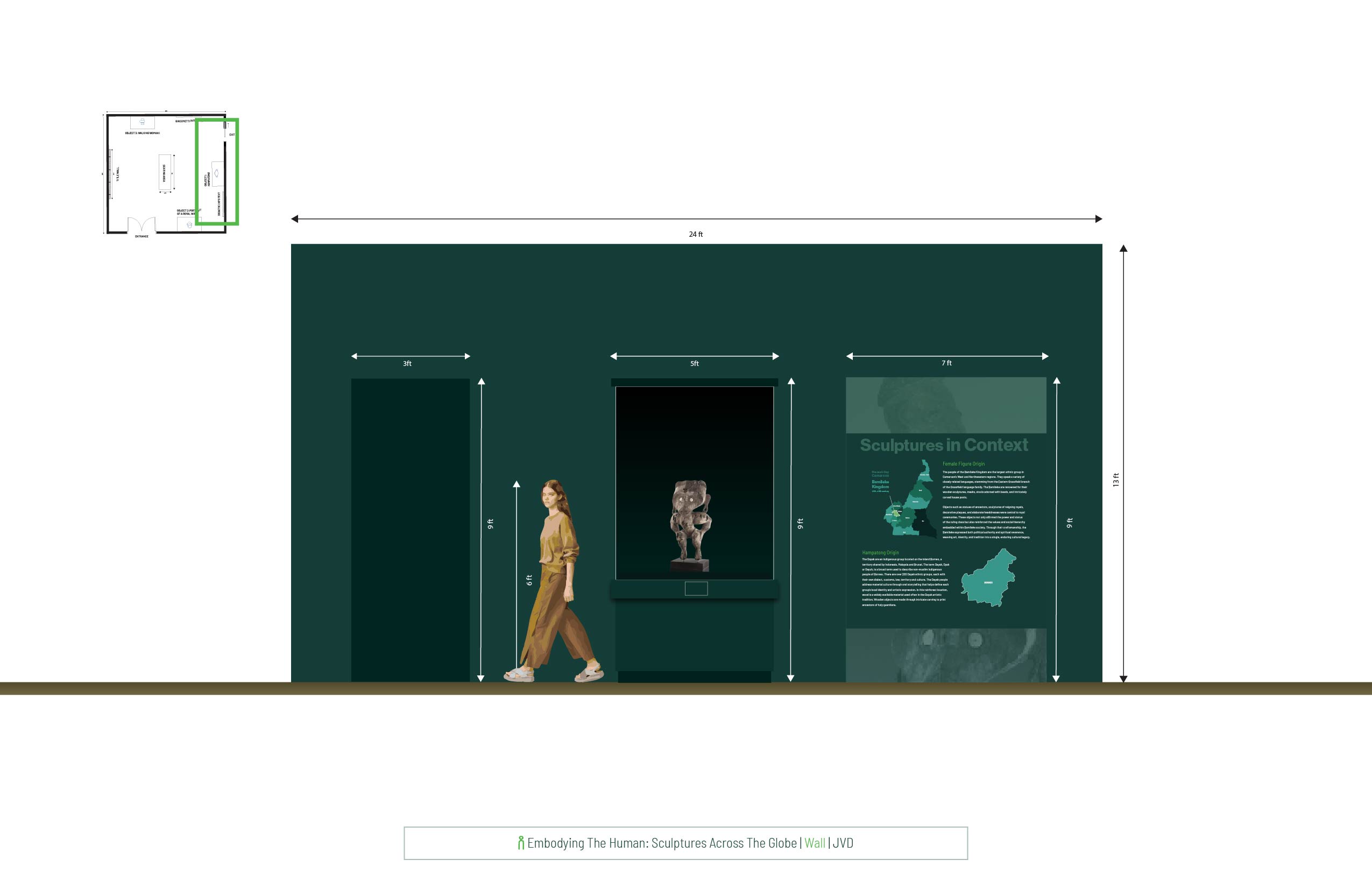
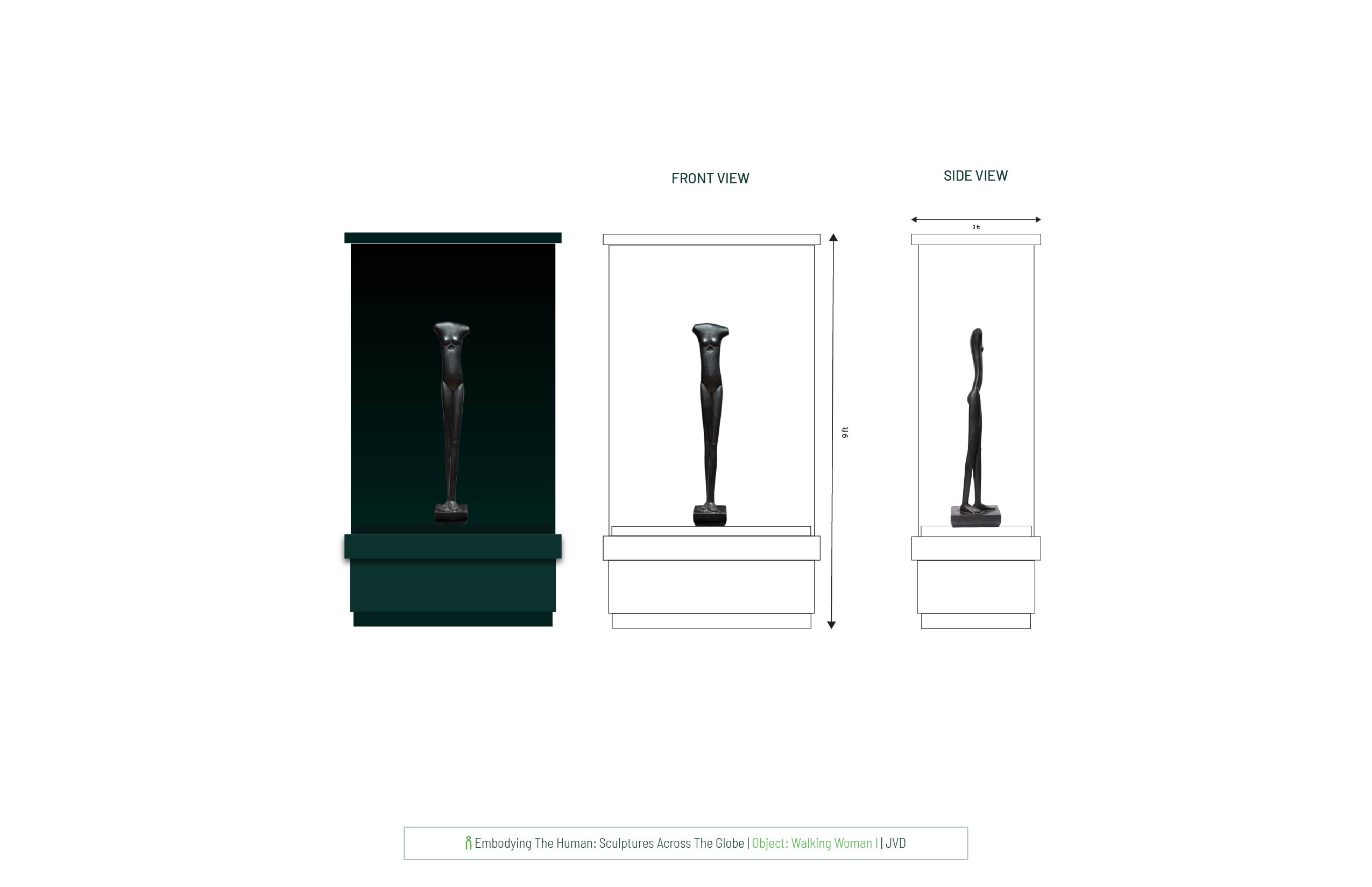
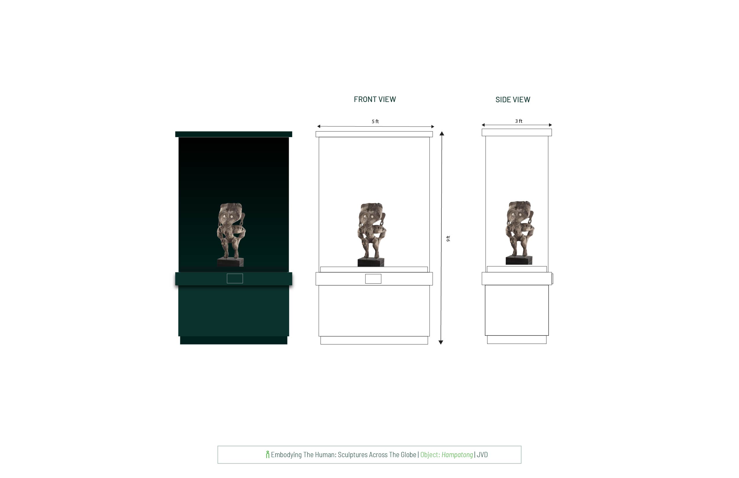
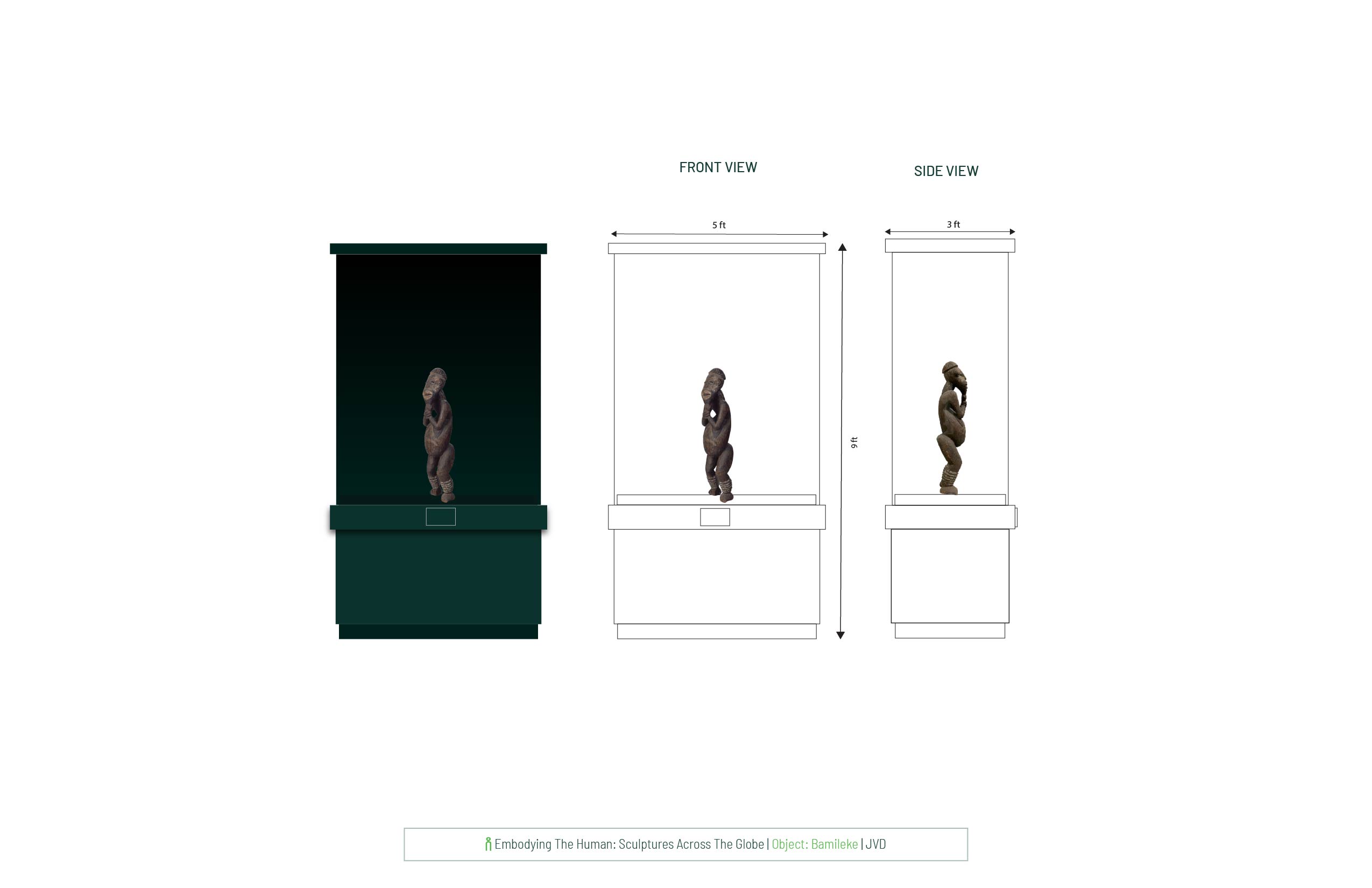
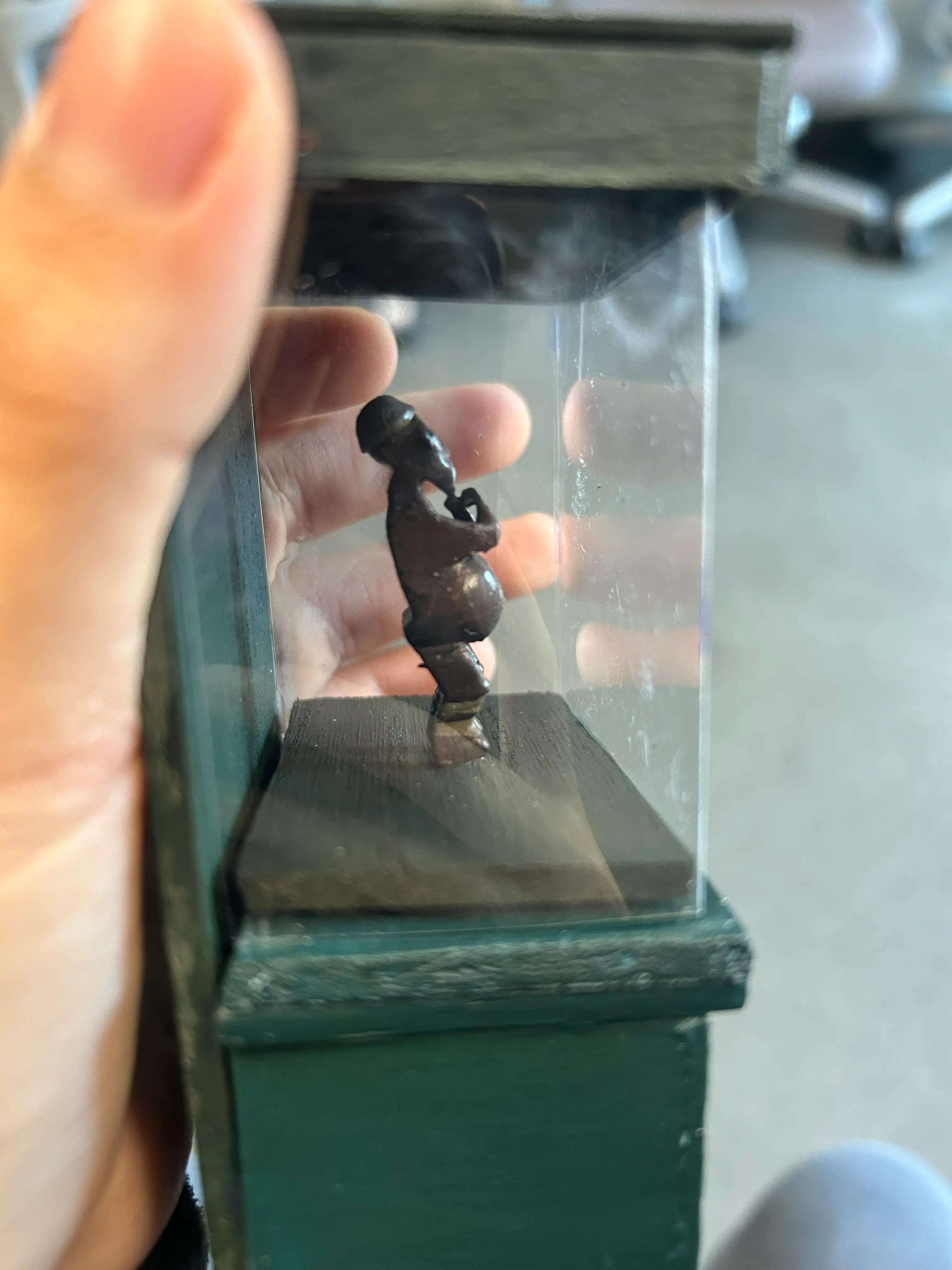
This exhibition aims to explore the different ways multiple cultures over time have used the human body in sculpture. The three objects featured in this exhibition come from vastly diverse settings and relate to different traditions. What unites them is the urge to convey the human form and to invest it with meaning.

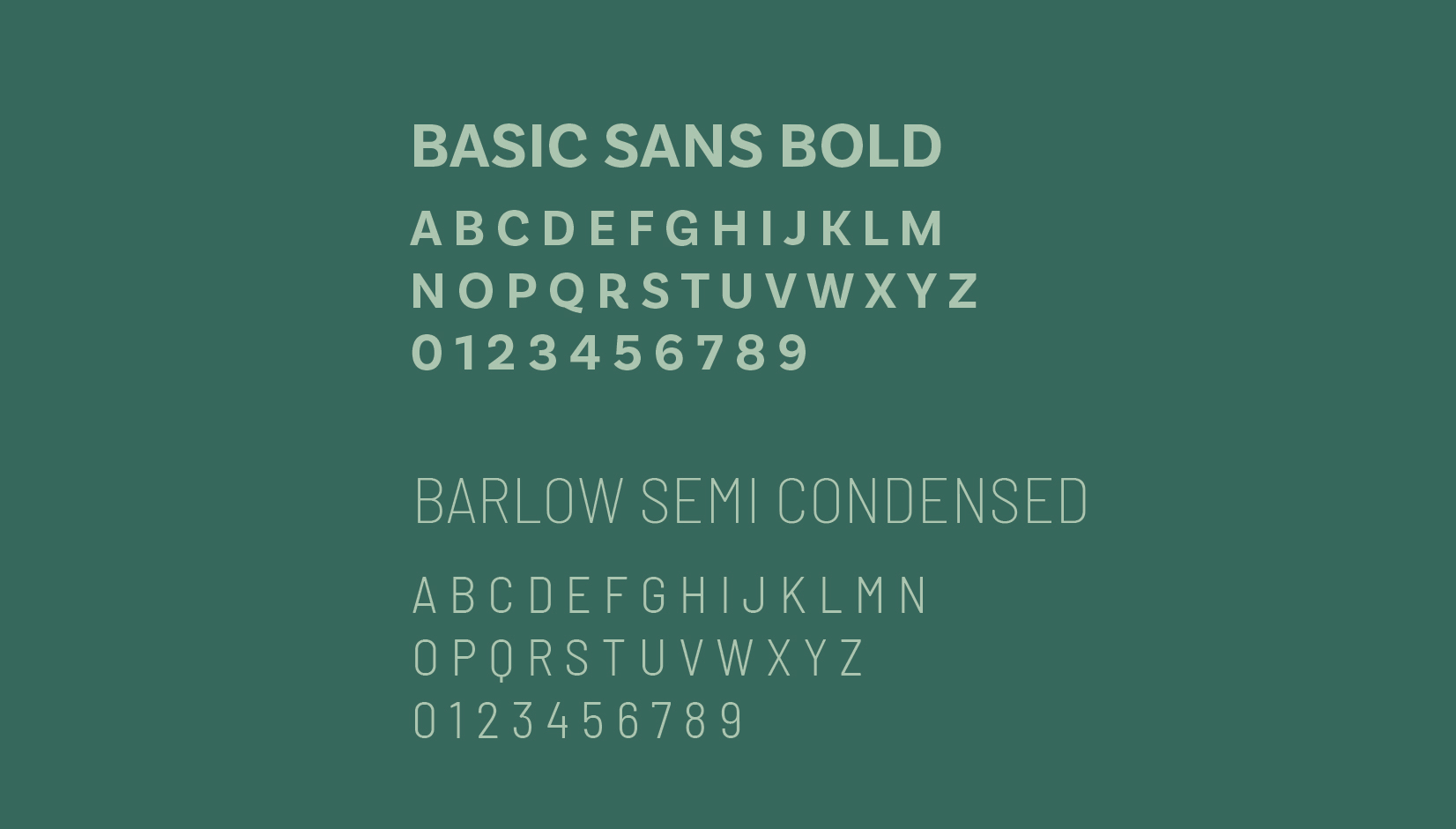
FONT + COLORS
Barlow was chosen for the subheading and body text because of its visual lineage tied to post–World War II design. One of the artists in this exhibition, Alberto Giacometti, used sculpture as a way to cope with the psychological distress caused by the wars he survived. Similarly, Modernism, which popularized the use of sans-serif typefaces like Barlow, emerged in the postwar period from the belief that clarity, restraint, and functional aesthetics could help rebuild society.
 | jerseyvargasdamian@gmail.com